
Syntax is Phrase’s design system, built from a scattered UI into components and Figma files product teams can actually trust

Context
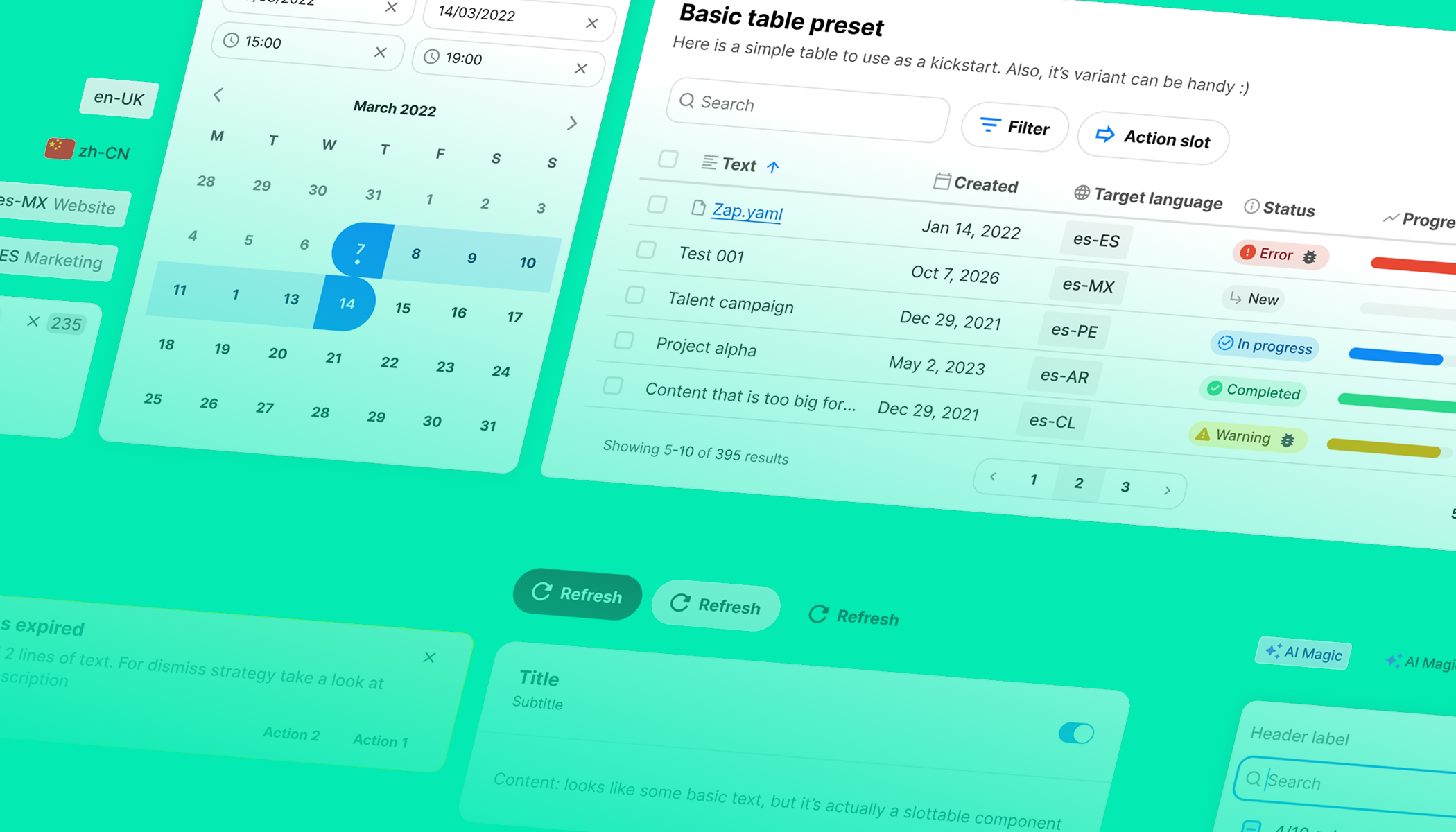
When I joined Phrase the product UI was a patchwork. Teams built the same components over and over — buttons, dropdowns, form inputs, empty states — each in a slightly different shade of the same idea. Every screen looked like Phrase, and none of them looked like each other. Designers redrew the same select every sprint. Engineers copied the last button they could find in a nearby feature.
Opportunity
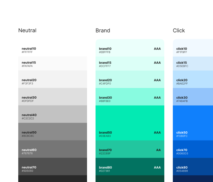
The opportunity was to give designers and engineers one shared language for the product — components with predictable behaviour, tokens with clear intent, and a Figma library that matched what shipped in code.
Not a rulebook. A shortcut. Something people reached for because it was faster and safer than starting from scratch.
Shaping the product
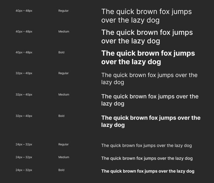
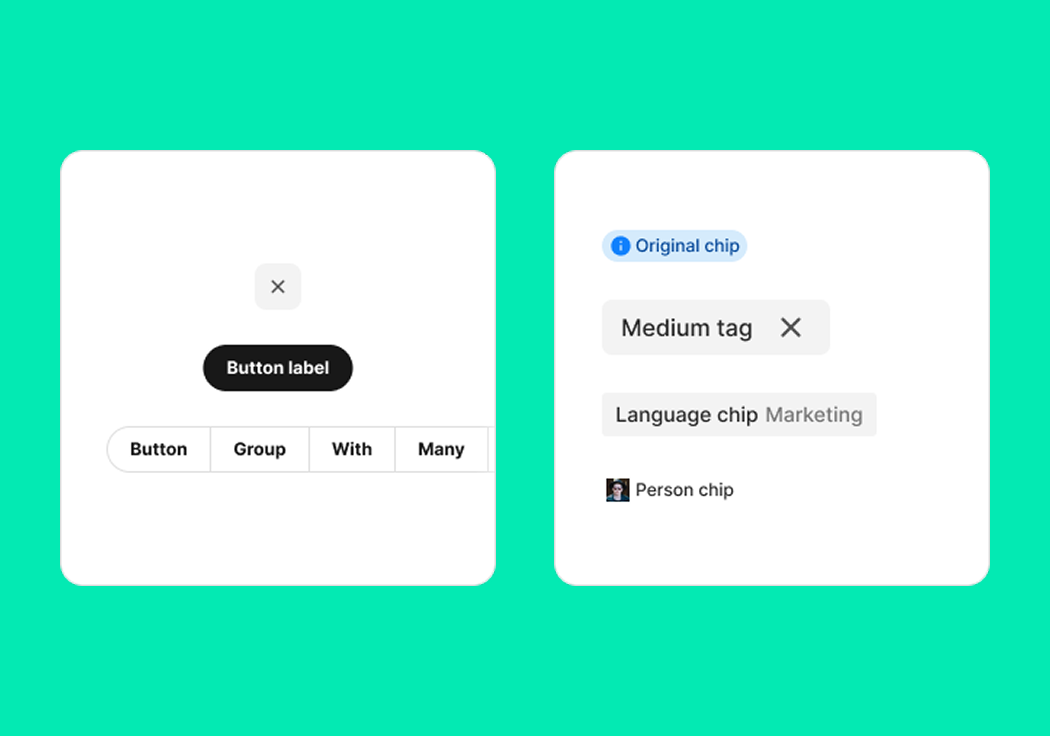
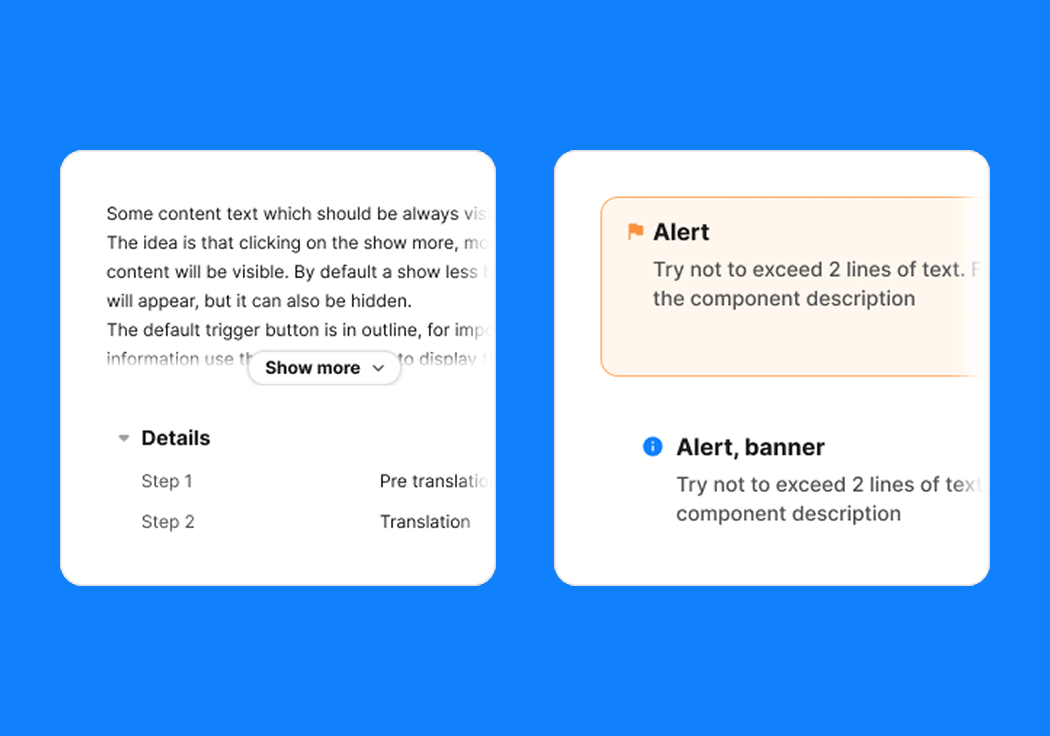
I started with the first pieces — buttons, inputs, selects. I wrote the guidance that came with them: when to use each, what states existed, how to compose them. I shaped the accessible defaults so no one had to remember to be inclusive; the components did it for them.
Along the way I kept nudging the work from spare-time maintenance into real product infrastructure — with the roadmap it deserved, the pairing with engineering it needed, and the shared ownership it couldn’t survive without.
Designing the experience
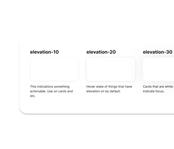
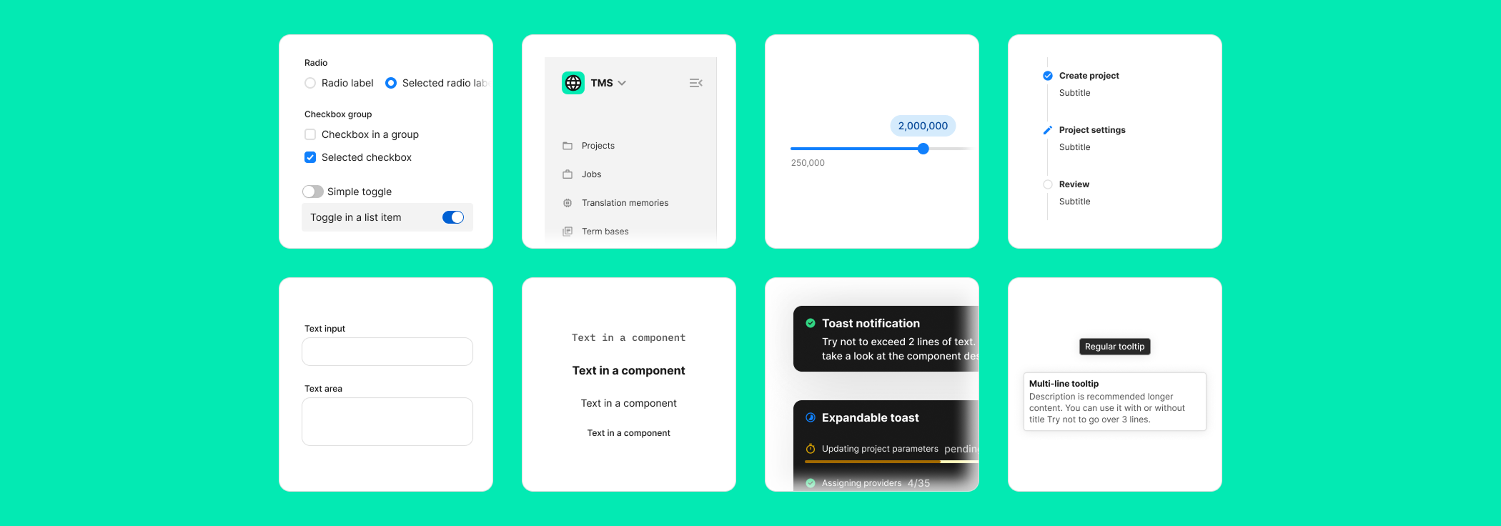
The system had to feel like a shortcut, not a stop sign. Every component was designed to be dropped into a screen without a spec on the side — hover states, disabled states, focus rings, empty states, all pre-solved.
The Figma files matched the production code, so the moment a component moved in the file, it was ready to move in the product. That closed the gap where design systems normally die: the space between “here’s the pattern” and “here’s the code”.
Outcome
The best part was watching teams stop rebuilding the same thing. Designers reached for Syntax instead of redrawing a button. Engineers reached for it instead of copying an old one. Reviews got faster because there was less to argue about — the small decisions were made once, together, and everyone moved a little faster with a little more confidence.
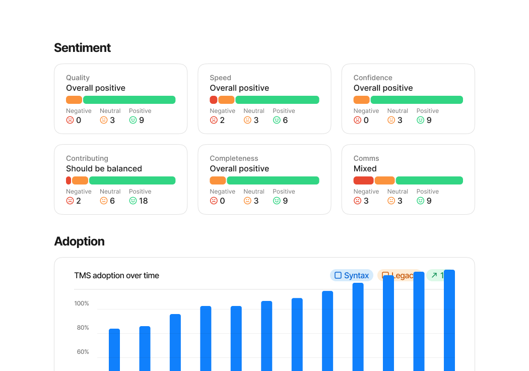
Five years in, Syntax runs across every core Phrase product. Components get pulled from Figma tens of thousands of times each six months, and satisfaction on the parts we measure stays comfortably above 90%.
- ~100%
- Syntax adoption across every core product
- 150k+
- Figma component inserts each six months
- 95%
- teams positive on Figma library ease of use
- 93%
- teams positive on documentation sentiment
Today
Syntax keeps growing. What started as a handful of components is now the library most teams reach for by default. It shapes the product I still work on every day.
The lesson I keep coming back to: a design system earns its trust one component at a time. Every well-shaped default is a small argument for the next one. The hardest part isn’t building the first version — it’s making the second version the obvious next step.