
Share Now was a free-floating carsharing app designed to feel familiar on day one to four million people who never asked for a merger
Context
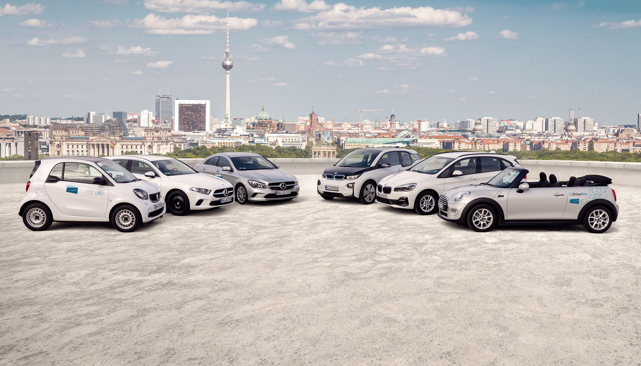
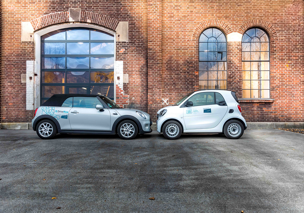
In 2019 Daimler and BMW combined their carsharing services into Share Now. Two established apps, four million existing users, two brands with real fanbases. The merger existed mostly to consolidate app development — car2go had a proper product team behind the app, while DriveNow’s was maintained by a smaller, more freelance setup. If we were merging to move faster, the honest choice was to keep the car2go app and sundown the DriveNow one.
Opportunity
That decision handed us the real design problem. We had to migrate DriveNow users into an app they had never opened, without losing them. And we had to rebrand the car2go app into something car2go users had never seen, without alienating them. Neither audience could feel like the loser in the merger.
The opportunity was to pre-migrate the product under the old brand, then swap brands on a single day — when everyone was already inside the new UX.
Shaping the product
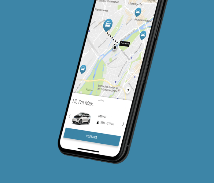
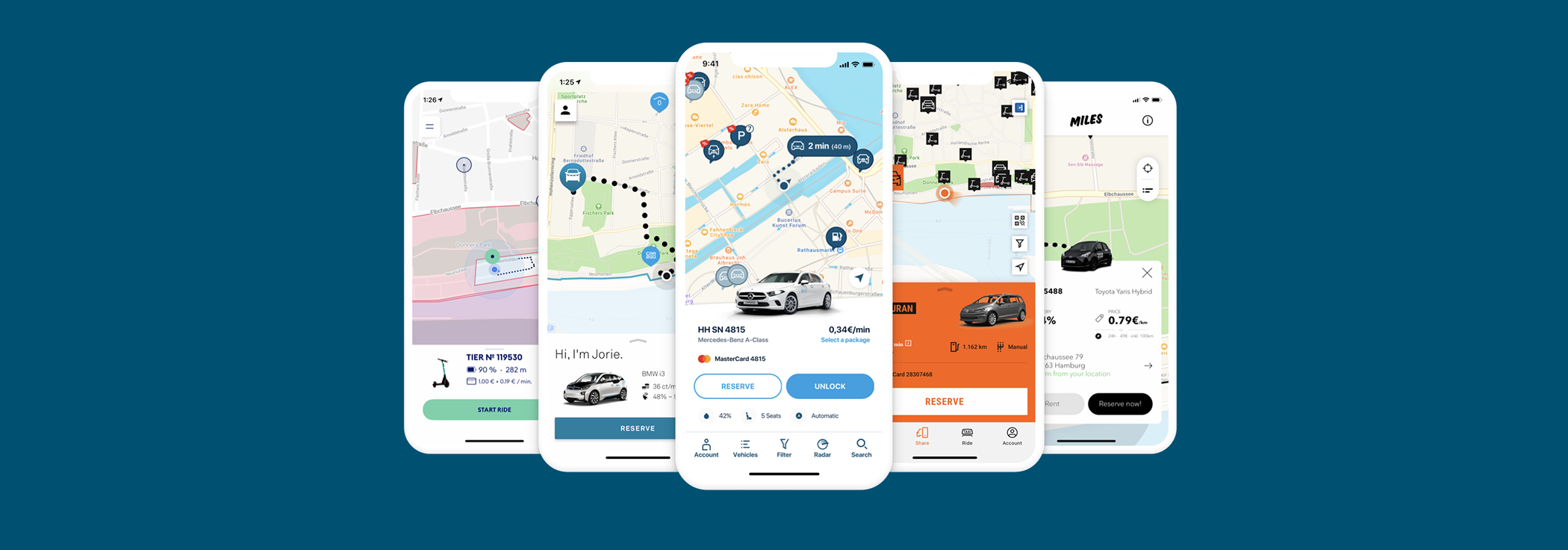
I led the project on two fronts. On one side I worked with the branding agency on the new Share Now identity — logo, name, colour palette, campaign visuals — and brought pieces of it back into the app team so we could see what Share Now was going to look like before it existed.
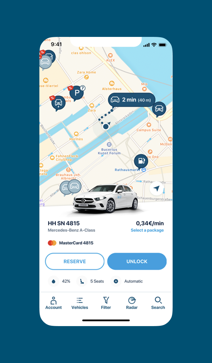
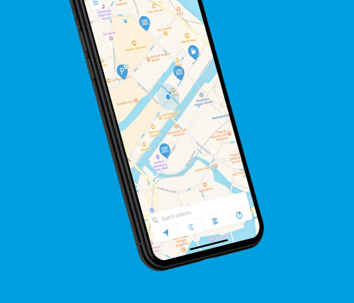
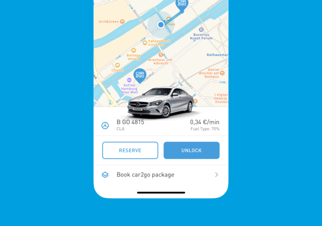
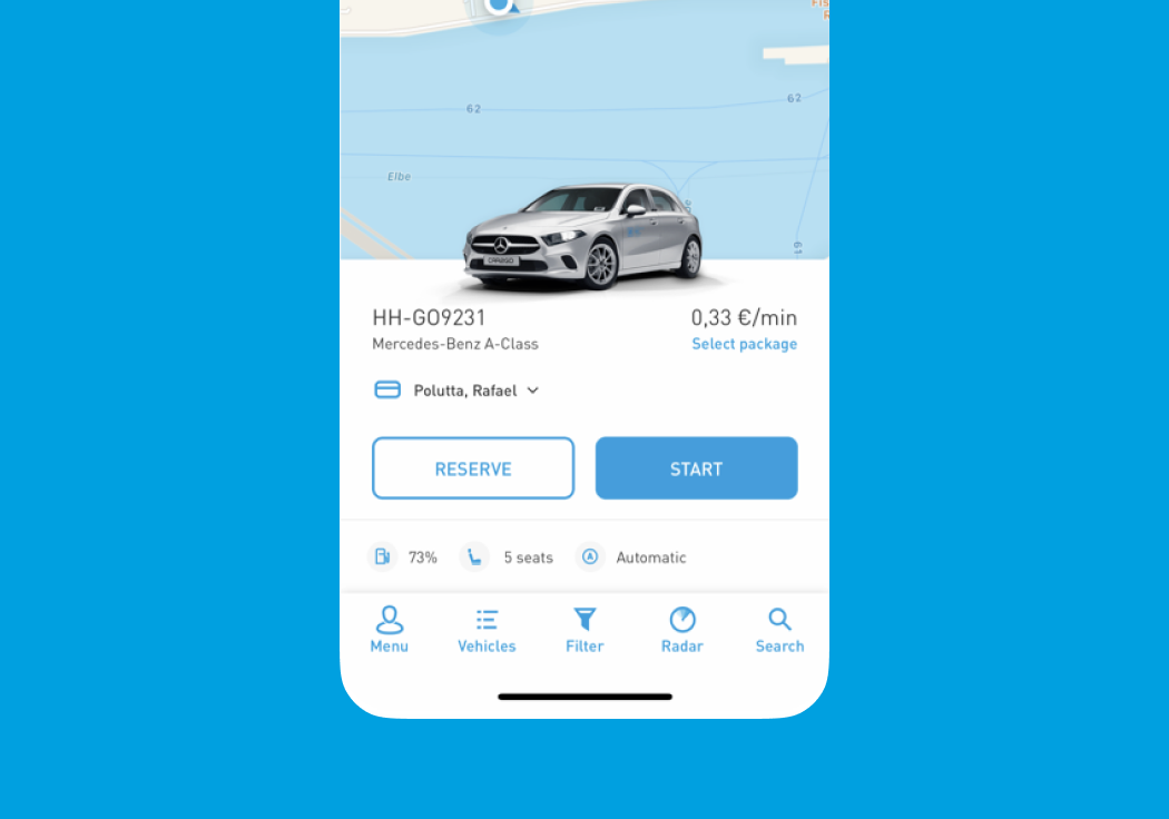
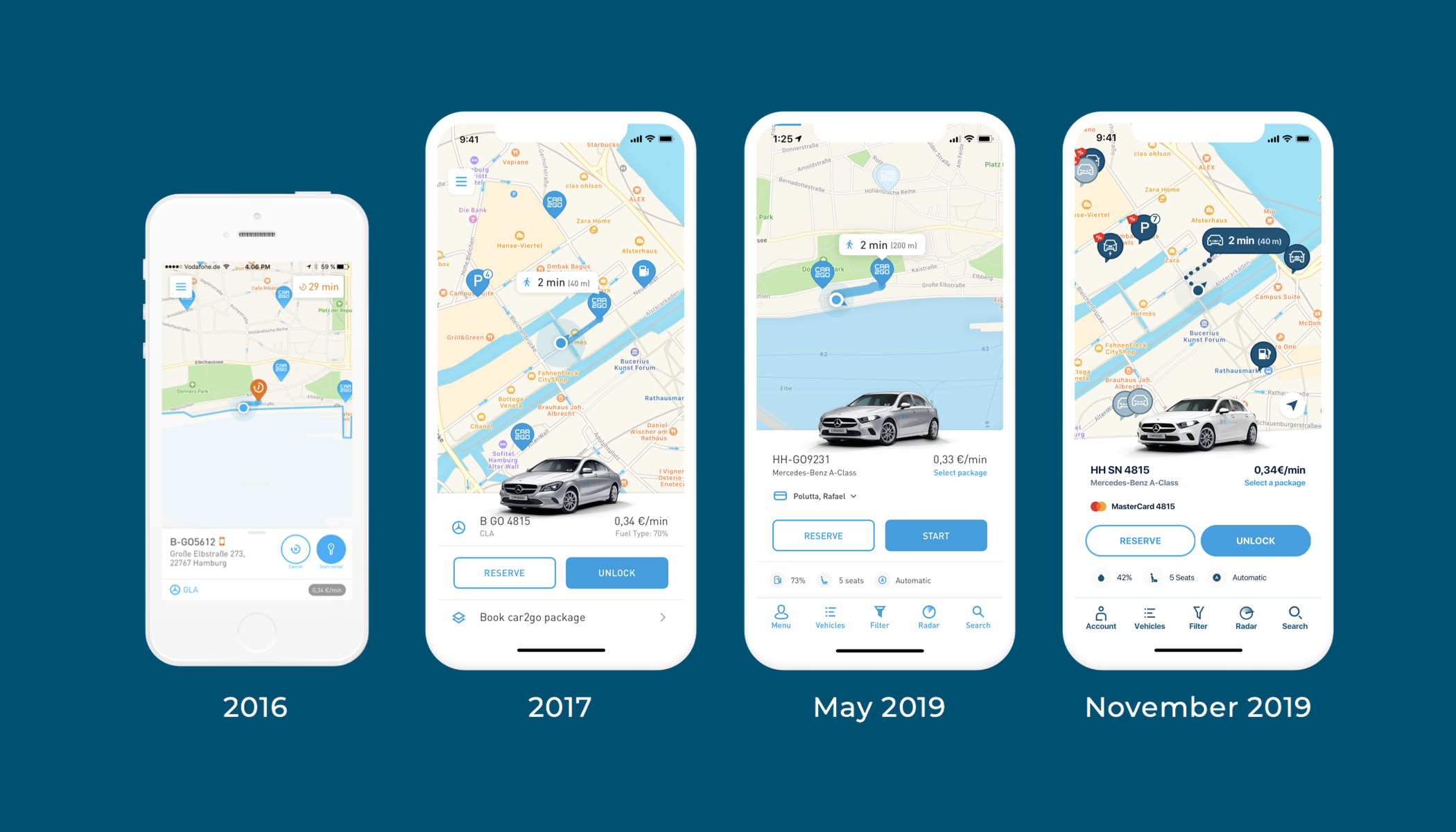
On the other side I prepared the car2go app to become the future Share Now app — still in car2go clothes. New map pins. A new vehicle panel with more information than before. Package upsell surfaced earlier in the flow. Every change shipped as a familiar car2go update, while quietly assembling the shape of what came next. Small moments of reassurance along the way — familiar shapes in familiar places — so nothing about the app started to feel foreign before the brand caught up.
Designing the experience
The vehicle panel was the moment every rental hinged on — the screen where you decide whether the car is worth walking to. We iterated three times: minimum information first, then legibility, then the balance between panel and map.
The final iteration set the pattern I still see today. A vehicle image up top, fuel or battery and walk distance in-line, one clear rental CTA underneath. That layout later showed up — in variations — across TIER, Sixt, Miles, Free2Move and most of the sharing apps I check. I don’t own the pattern. But I was proud to have been early to it.
Outcome
The package-selection test we shipped in the run-up drove real movement. On switch day, the DriveNow app was sundowned and its users were pointed into ours. The car2go app changed its logo, palette and name to Share Now — but not the flow underneath. Weekly active riders held flat through the migration, which was the number that would have killed the whole exercise.
- +3,7%
- more users confirmed with a package
- −4%
- fewer switched their selection mid-rental
- 4.5★
- App Store rating held across the rebrand
- Held
- weekly active riders through the switch
Six years later
I delivered the project happy with the outcome and proud of the app — from the UI to the UX to the animations and small movements between screens.
Share Now has since been sold off and is run by Free2Move now. Opening the app today, the map, the vehicle panel, and the screens I designed back then are all still there. Only a new coat of branding paint on top, from what I can tell.
Pretty cool. Also a little sad that apparently no designer or team has moved the designs forward. Today I would do so much differently and make it better in ways we couldn’t back then. But hey — it’s kind of timeless, and still good. Not the glamorous kind of redesign. The useful kind — carry people through a big change without making them think too hard.